2017年は池袋と名古屋パルコ、2018年は池袋と広島パルコのクリスマスウィンドウのディスプレイデザインを担当。
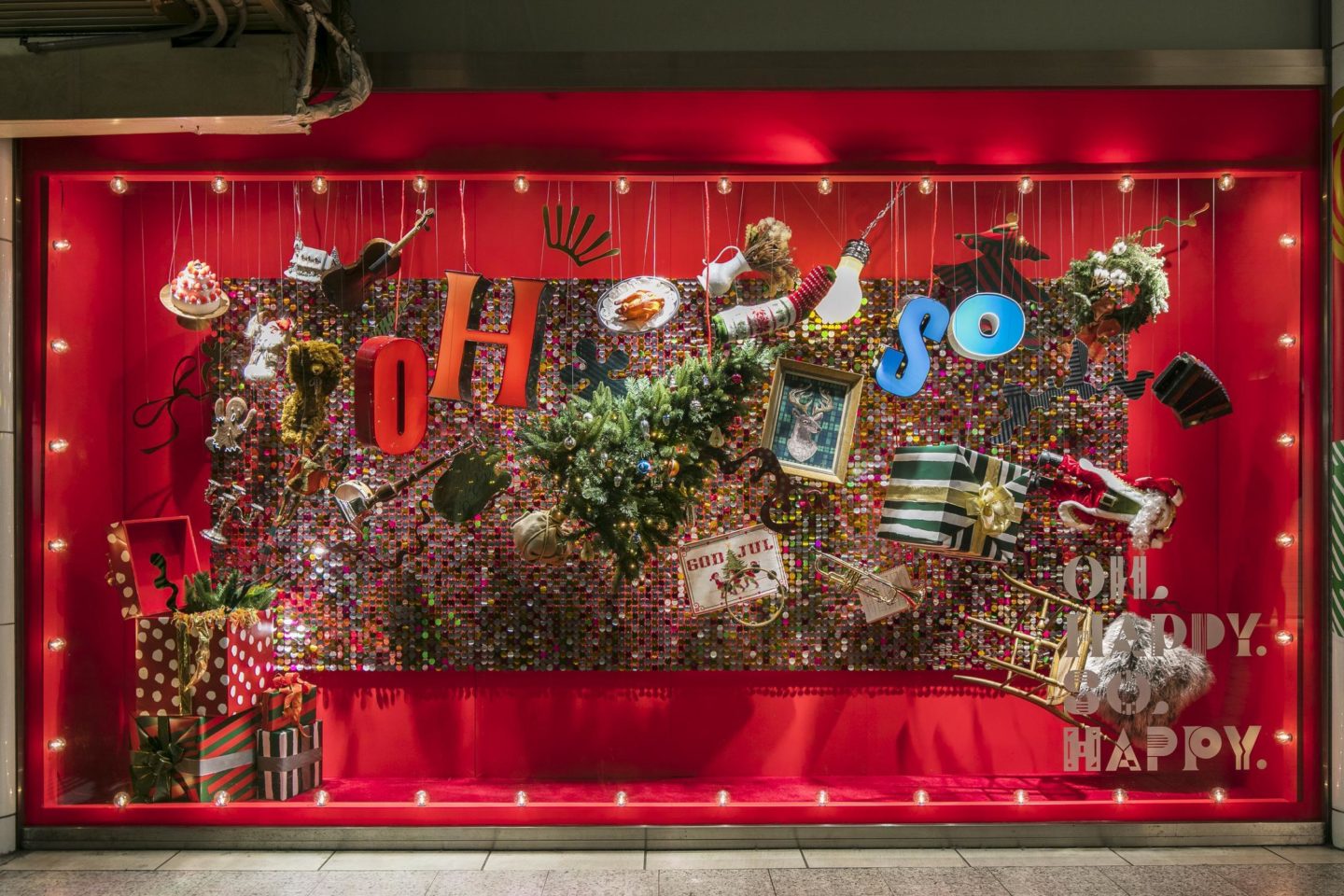
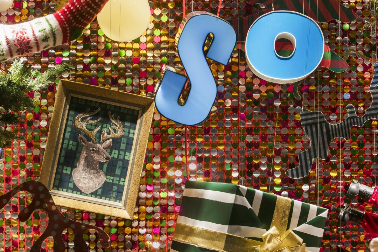
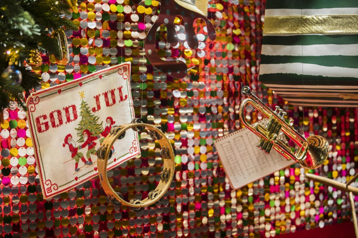
2018年は’OH HAPPY SO HAPPY’ というディレクションテーマの元、プレゼントボックスから様々なクリスマスアイテムや楽器などを飛び出させる演出。オーセンティックな赤とライトを背景に、スパンコールを揺らし、動きや躍動感、高揚感のあるディスプレイにしました。
In 2017, I was in charge of the display design for Christmas windows in Ikebukuro and Nagoya Parco, and in 2018 for Ikebukuro and Hiroshima Parco.
In 2018, under the direction of ‘OH HAPPY SO HAPPY’, various Christmas items and musical instruments pop out of the gift box. Against the background of authentic red and light, the sequins are shaken to create a display with movement, dynamism, and excitement.
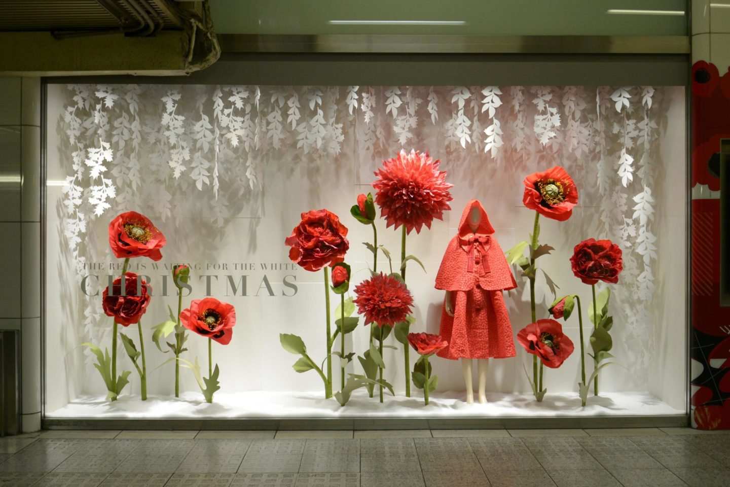
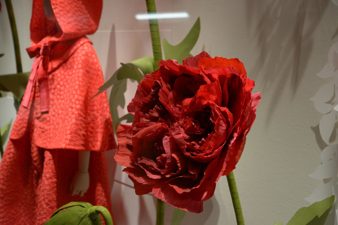
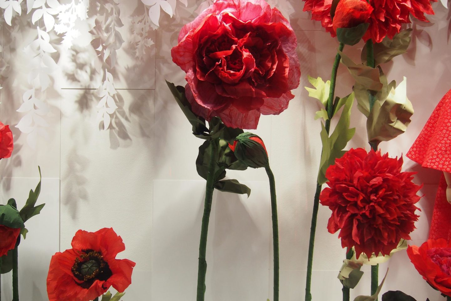
2017年は ’THE RED IS WAITING FOR THE WHITE’ というテーマの元、 静かに佇むクリスマスを演出。衣装デザイナーの作品の展示と共に、女性ユニットmimosaの作る巨大なペーパーフラワーで赤を表現しました。対する白という色は、素材によって奥行きも違えば見え方も幅広く、簡単な様で一番難しい色。今回は紙やペレットなど安価な素材を使いつつも、高級という言葉に対するアンチテーゼを込めつつ、より高級感や奥行きを持たせた演出になっています。
In 2017, under the theme of ‘THE RED IS WAITING FOR THE WHITE’, a quiet Christmas is produced.
Along with the display of the costume designer’s work, the color red was expressed with a huge paper flower made by the female unit mimosa.
On the other hand, the color white is the simplest and most difficult color as the depth varies depending on the material and making it more appear as wider.
This time, while using inexpensive materials such as paper and pellets, while incorporating antithesis to the word luxury,
It has a more luxurious and profound look.